Let's Work Together

xl
lg
md
sm
xs
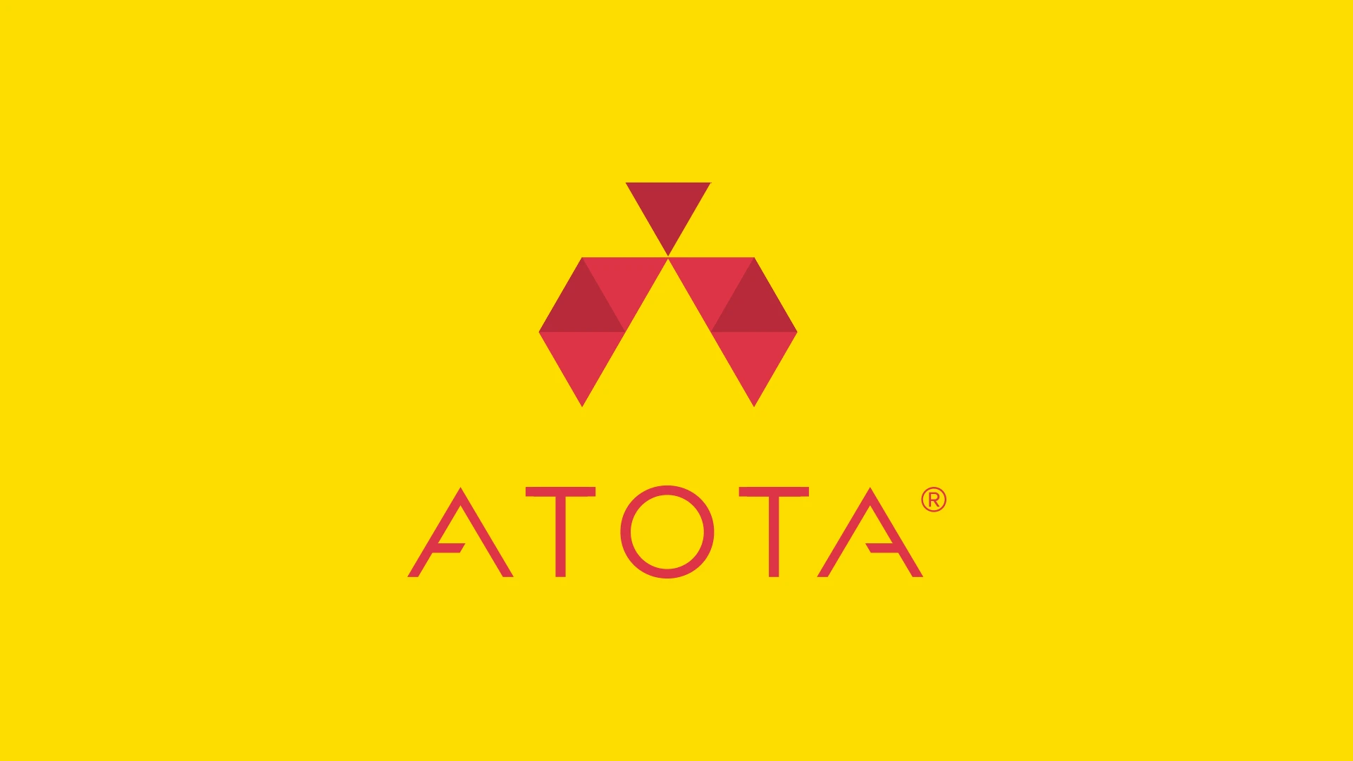
A distinctive identity inspired by structure and connection, designed to reflect Atota’s position at the centre of national networking and communications infrastructure.
To create a distinctive brand identity for Atota, the parent company of Saratota, that communicates structure, clarity, and cohesion at a national scale.
Our approach centred on balance and definition, drawing inspiration from the form and meaning of a ternary graph to create an identity that reflects interconnected systems, precision, and calm authority.
We delivered a bold yet refined identity, combining geometry, typography, and subtle motion to express Atota’s role as a stable force in a fast-moving communications landscape.